As soon as you walk into a restaurant, you quickly judge the vibe and menu within just a few seconds by walking around. You might not even notice it, but the colours around you can really influence how you feel about the place and the food. By diving into the world of restaurant colour psychology, you can tweak your business to attract more customers and encourage them to try more of your delicious dishes.
This blog will break down which colours get those appetites going and which ones you might want to avoid in your restaurant.
Which colours make you hungry?
In a competitive business world, every little thing counts. If the colours on your walls can help your customers feel at ease and encourage them to order more, then repainting them is definitely a smart move. Here’s a list of colours that boost appetite, helping you leverage restaurant colour psychology to your advantage.
1. Red
Red is a colour that grabs your attention right away. Imagine you have a plate sitting on a red placemat and another on a black one— which one catches your eye first? This vibrant hue is famous for giving you a little energy kick, sparking your impulses, and even making your heart race. In nature, red often represents delicious, sugary fruits, which can make you feel hungrier without you even realising it. Fast food joints love to use this colour, but you can definitely find creative ways to add it to your restaurant’s vibe, no matter what type of cuisine you serve.
2. Yellow
When it comes to restaurant vibes, yellow is all about happiness and energy. It triggers the brain to release serotonin, which gets people excited about their upcoming meal. Softer yellows are often linked to food, but if the yellow is too bright, it might make diners feel a bit uneasy, causing them to eat and leave quicker.
3. Orange
Orange, like red, can boost your appetite and give off a lively vibe, but it doesn’t have the same rush factor. It creates a cozy atmosphere, though you should be careful not to overdo it since too much orange can be a bit overwhelming. Plus, it’s linked to good value, encouraging folks to hang out longer at your place. And let’s not forget, orange often reminds people of orange juice, evoking thoughts of healthy eating.
4. Green
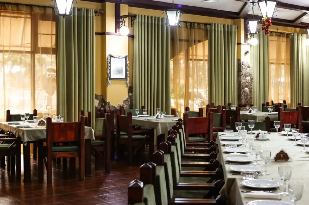
Green might not pack the same punch as the bolder colours, but it still gives a gentle nudge to your appetite. We often associate it with leafy greens that are good for us, even if they don’t taste as sweet as those juicy red fruits. It’s pretty much the go-to colour for anything healthy, fresh, vegetarian, or vegan. Then there’s turquoise, which blends green and blue; it also lightly boosts your appetite while bringing a soothing vibe thanks to the blue.


Which colours to skip for your restaurant?
While rules can be bent, it’s helpful to know a bit about colour psychology in the restaurant world. Certain colours aren’t found in natural foods, so diners might not connect them with eating out. Here are some colours you might want to avoid in your restaurant.
1. Black
Black is all about elegance and sophistication, but it doesn’t do much for the visual appeal of your food. Instead, think about using black for these aspects:
- Menu text: It stands out against white, making your menu super easy to read.
- Logo: A single contrasting colour keeps it simple and adds a nice touch to highlight other features.
- Decorations: Unless you’re going for a dinner-in-the-dark vibe, steer clear of black walls since they can make a space feel cramped. Instead, use black for smaller decor items to enhance the overall look.
2. Brown
Brown works well if you’re aiming for a cozy, rustic feel or if your place has a farm-to-table theme. It’s also a solid choice for coffee shops since it evokes thoughts of coffee and baked goods. But generally, when people think of brown, they picture dirt and dust, which isn’t exactly mouthwatering.
3. Blue
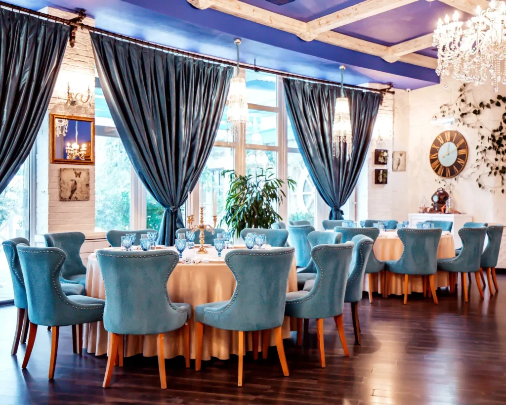
Blue is a soothing colour that encourages relaxation and sleep. While it’s perfect for bars, it’s not the best choice for restaurants since it can dull the appetite. However, if your restaurant has a nautical theme, incorporating blue in the decor can suggest a sense of freshness.
4. Purple
Purple is a colour that many people associate with things like toxins or not-so-great foods, like red cabbage. When it comes to how colours affect the vibe in restaurants, purple suggests royalty, luxury, and high quality. This makes it a great choice for things like upholstery, but it’s probably not the best pick for large spaces like walls or ceilings.
Understanding Restaurant Colour Psychology
Now that you’re familiar with how different colours can influence appetite in restaurants, let’s explore how to put this knowledge to work in the most noticeable aspects of your business.
1. Top colour choices for your restaurant logo
Your restaurant’s logo is the first thing that catches people’s eyes and sticks in their minds. It should aim to:
- Reflect your brand’s vibe: The colours need to represent your restaurant’s identity, whether it’s fun, vibrant, classy, or healthy.
- Make a lasting impression: You want a logo that’s easy to spot and remember, helping to build brand loyalty and encourage repeat visits.
- Communicate about the brand: The colours in your logo should give a hint about the kind of place you run, whether it’s upscale dining, quick bites, or a vegetarian spot.
Feel free to mix and match any colours that best represent your restaurant’s vibe. Here are some classic combos to consider:
- Red and yellow: These colours are instantly recognisable from McDonald’s. They’re great for sparking appetite and encouraging action.
- Green and brown: Perfect if you want to highlight a focus on healthy eating. You can swap out brown for any colour that contrasts well.
- Orange and teal: This duo is popular in movies for a reason—it’s super easy on the eyes. Plus, orange is known to boost appetite.
- Blue and white: You could go for teal with off-white, or dark blue paired with cream. These choices give off a classy and elegant feel for your restaurant.


2. Pick the best colour for the menu
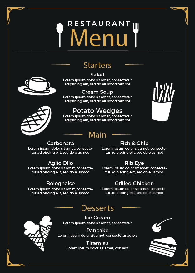
Choosing the right colours for your restaurant menu is key to building a strong brand identity. Consistency is crucial, so make sure your menu colours match your logo and other branding elements. However, don’t forget about readability. A colourful menu might look nice, but if your customers can’t quickly find what they’re looking for, they could get annoyed and head somewhere else. To design a menu that your guests will love:
- Go for the classic combo of black text on a white background for easy reading.
- Use colour sparingly, like a splash of red to draw attention to special deals.
- Let professional food photography add some vibrant visuals to your menu. Tempting images will make it difficult for hungry diners to resist.
3. Choose the right colours for the interior
Choosing the right colours for your restaurant’s interior is about matching them to your cuisine, the vibe of your place, and the atmosphere you want to create for your guests. Here are a few ideas to spark your creativity:
- Soft shades like ivory, beige, white, pale yellow, and light grey work great for a cozy, traditional sit-down restaurant, helping to make the space feel more open and inviting.
- Bright colours like yellow, terracotta, orange, red, and gold are perfect for a fast-food joint since they not only whet the appetite but also help turn tables faster.
- A bold mix of yellow, red, grey, and black can really make a statement for a restaurant looking to stand out.
Understanding how colours affect the mood in restaurants can really set you apart from the competition. By picking warm, appetizing colours, you can attract more customers who will choose your place over others.
Looking to boost your orders with killer designs?
Your business needs to be authentic, and it needs to have a personality that appeals to your target market. We help shape and create brands that resonate with your target audience. Everything from logos to brand guidelines is covered for you. Reach out to us today.

